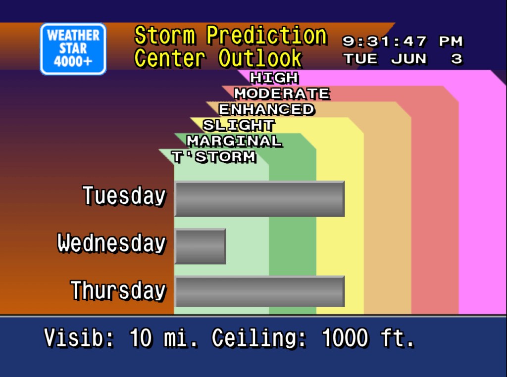
Retroist recently wrote a great history and discussion of the Weatherstar and the nostalgia that surrounds it. It’s really a great read. The Weatherstar 4000, Then and Now.

Retroist’s WS4KP display

The article sparked a memory related to the Weather Channel and Cable TV that I wanted to share. In the heyday of cable TV and our favorite local forecasts in the mid 90’s you might occasionally have to go into the cable company office in your town. Some would even pay their bill in person this way if they didn’t want to mail a check each month. I was in grade school at the time and remember going in there just a few times.

To most this visit was uneventful and pretty boring. You’d walk into the building beside large satellite dishes pointed at various places in the sky. These are what brought in TBS, The Discovery Channel, WGN, CNN, HBO and plenty of other channels from all over the country. The astute observer may even notice the antenna mast on top of the building with smaller antennas pointed in different directions to pick up your local network stations like NBC, ABC or your PBS affiliate.

The building was a necessity to house all of the hardware associated with delivering cable TV. They just happened to have a desk inside the front door where you could talk to someone about your service or pay your bill. They were also the ones who answered the phone if you called, often in just 1 or 2 rings! The office in my hometown showcased some of their technology. Behind the desk was a glass wall, and behind that glass wall what what I now know are 19″ racks that housed all of the cable TV equipment.

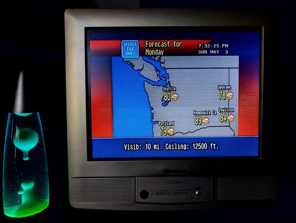
I’d stare past the desk at all of the blinking lights and cables. I recall a lot of 2U black boxes (I only now know the sizes) that had those plastic, wood-grain labels with white lettering embossed on them. The labels called out channel numbers and networks like “22 Nickelodeon”. There was one box in that rack that stood out. It was twice as tall, white and had a large blue rectangular logo of the Weather Channel on it.

Original Weatherstar Hardware via Tom Nardi/Hackaday
Original Weatherstar hardware via Tom Nardi/Hackaday

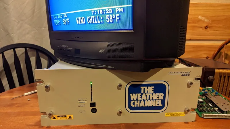
This image comes from Hackaday where you can read how Tom Nardi resurrected this piece of cable TV history. it’s the exact box I remember seeing behind the desk at the cable company’s office. And because it was bigger and different I knew something special was happening inside of it. I already watched the weather channel all the time. I realized the local forecast was something special that no other channel in those 40-some we had available could do. And to see this box in person just further peaked my interest in The Weather Channel and the technology behind it.

Thirty years later I’m still very interested in these memories from the 90’s and am very glad that I live in a time where it’s possible to recreate the look and feel of what Retroist calls “genuinely well-designed.” The internet and web browsers are what make this possible. But the internet also allows the retro weather community to share old videos, discuss their memories, and collaborate on the details of this project and the add-on projects such as the international version and the streaming ws4channels implementation. It’s the community around this that is so much fun to be a part of.

Upcoming WS4KP Enhancements

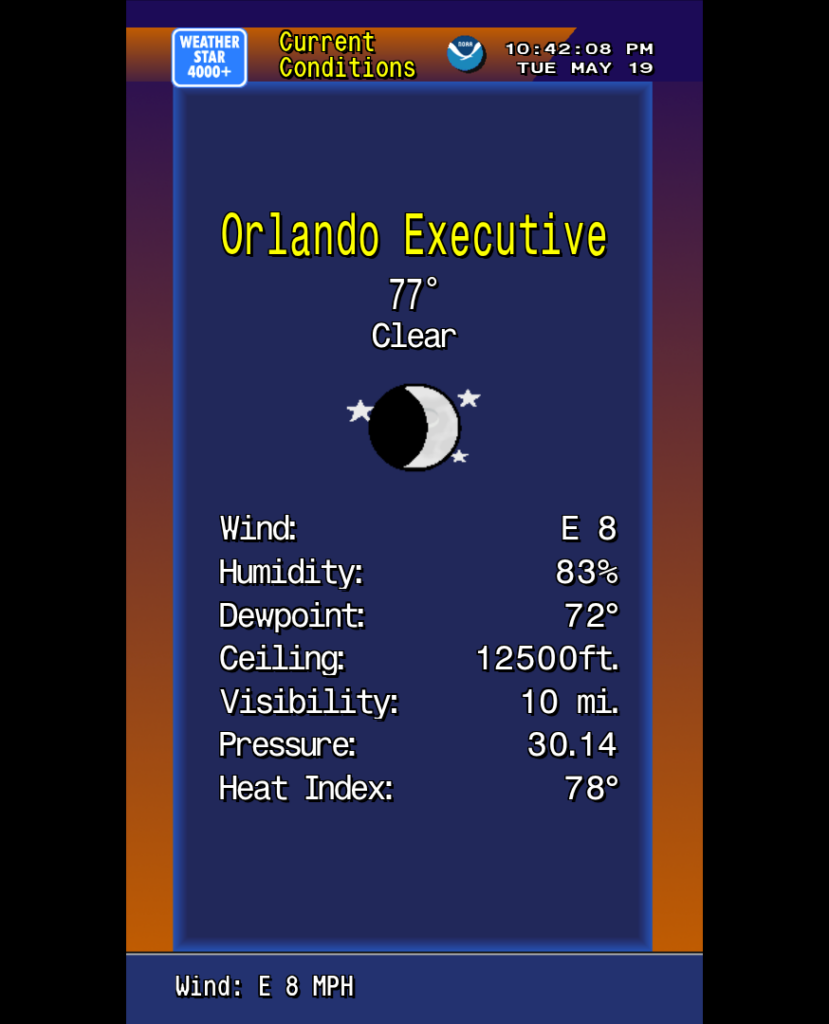
For those of you still reading I have some exciting Weatherstar news. There will soon be 2 new modes what Ws4kp can run in. The enhanced modes will add more data to the classic displays. Enhanced widescreen displays will show more days into the future, wider maps or just make better use of the letterbox space. And a new enhanced portrait mode rotates the screen and lays out the graphics is the same style, but making much better use of the space vertically. Larger maps, more nearby weather stations and more days in the extended forecast are just some of the upgrades.

Preview of the new enhanced portrait mode

I will stick with my no-fuss way of running this and for nostalgia first time users will continue to see the 4:3 original graphics with the newer modes optionally available. You can find out more, including some links to a preview, in the discussions and issues on github.

Thank you for supporting the Ws4kp project and for your interest in this community and nostalgia.

The Weatherstar 4000+ project has been a lot of fun to work on. And it received a huge boost the week of May 26, 2025 when it made the front page of Hacker News, and then to other social media sites. The outpouring of nostalgia for these forecasts and visuals has been incredible to follow along with. There were so many people sharing memories of vacations, childhood, parents and grandparents and many other great things. Thank you to everyone who has become a fan of this project.

Just a few weeks prior to the huge bump in traffic I added a new screen to the Weatherstar, similar to the Hourly Graph and Hourly Forecast I previously added. This time I took the original air quality report, which is not in the Weatherstar 4000+ because the data for it is not available in the APIs I use for weather data, and re-worked it to share the three day Storm Prediction Center (SPC) Outlook. It shows the likelihood of severe weather over the next three days.

New weatherstar 4000 screen showing the SPC outlook for the next 3 days
New SPC outlook screen on Weatherstar 4000+

The design of this new screen follows very closely with the design of the air quality display from the original Weatherstar hardware. The number of categories have been increased to match the SPC’s categories, and the color coding comes directly from the SPC generated maps which look authentic in the context of the Weatherstar. Three days are shown which takes the place of up to three cities that the air quality report would include. Some slight visualization adjustments were also added to help make the category and color linking easier to follow.

You can see the similarities and differences between the new screen and the screen capture of the original air quality display below.

Weather Channel screen capture from YouTube/cc17926

Please join the discussion at GitHub if you have questions or comments on the new screen.

The NEXRAD Tools for Javascript released earlier this year now have a demo available! As discussed in the history of the libraries it would be cost prohibitive for me to make nationwide radar images available. But I’ve found an effective way to make some of the images I use every day available.

Example reflectivity plot (not live)

The demo shows level 2 plots for reflectivity and velocity and level 3 data for the hybrid hydrometer classification. It also includes a timestamp and road/county overlay on the radar image for reference, but those items are not part of the actual plotting libraries. The plots shown on the demo web site are updated in real-time, but a page refresh is required to load the latest image.

The complete set of tools is available on GitHub.

Earlier this year I released the WeatherStar 4000+, a retro-looking weather forecast and current weather conditions app based on the look and feel of the 90’s Weather Channel.

We’re all used to weather information that’s very easy to access and is at our fingertips. My phone right now, in it’s “off” state, has a little blurb on screen with a few weather details. In the 30+ years since the WeatherStar debuted on cable both the accessibility and the amount of data available for a forecast is much more expansive.

For this project and for me the challenge and question has been can I integrate new forecast information and not disrupt the nostalgia of the system? After a lot of though earlier this year, I took a cue from the “Travel Forecast” scrolling screen and turned it into an hourly forecast in the same style. It fit within the aesthetic and worked very well to show off new hour-by-hour forecast data that is now available.

But I personally never liked the long scrolling screen. It just took too long to get all the way through it. So inspired by first several weather apps that provide a graph for the hourly forecast, and then another of my projects Tempreature.Express, I developed some new graphics for the WeatherStar4000+ for this exact purpose.

New WeatherStar4000+ hourly graph display

It’s new, and it’s not part of the original system. But I feel that it very well captures the low-resolution 90’s design of the original. A lot of considerations around how much data to display and how to arrange it were made. I borrowed as much as possible from already existing graphics such as:

  • The x-axis times borrow sizing color and location concept from the Current Conditions and Travel Forecast screens.
  • The legend in the top right is borrowed from the Radar screen.
  • The line graphics are inspired by the Marine Forecast display that isn’t present in this WeatherStar4000+ but is in other adaptations as well as the original.
  • The blue background surrounded by orange is used on many of the text based displays although slightly modified at the bottom for the x-axis labels.
  • The rest of the header and footer is common to almost all of the other displays in the original WeatherStar 4000.

Also part of my considerations were should I intentionally pixelate the graph? I decided against this. In a previous update to the WeatherStar 4000+ I changed from drawing on a canvas, which resulted in a pixelated look when used full-screen, to HTML and appropriate fonts. This means that everything appears clean and crisp when running full screen. The weather icons (such as “Sunny”) are still the same size and do appear slightly pixelated full-screen, but that’s part of the charm and nostalgia. I did go through the exercise of pixelating this new display by drawing it at half-resolution and then scaling up but it just looked bad against the background and text that all scales fairly cleanly. I backed out that change.

Please join the discussion at GitHub if you have questions or comments on the new screen.

Inspired by GRC’s Shields Up!, the port scanner from Net by Matt uses similar remote port scanning technology and includes IPv6 support.

The scanner will attempt to connect to ports at your IP address from netbymatt.com’s netowork and present results in a friendly grid format. All green “stealth” results are great!

The scanner has several uses besides overall security

  • Test to make sure a port is open, such as a VPN or web server
  • Test your network’s IPv6 connectivity. The scanner link above will attempt to connect to on both IPv6 and IPv4 and will present to you both addresses if both are found. You can then select which address to scan.
  • Finding your IP address remotely
  • Testing a headless server – The returned HTML is in a very straight-forward format and can be easily scanned by a human after running curl or similar from your server.

There’s a lot of technology behind the scenes to make this work. The link above has full details but some of the highlights include:

  • Scan originates from a different address than netbymatt.com
  • Micro-service architecture allows for easy scaling during traffic spikes
  • Written entirely in Node.js
  • Javascript is not used to show the scan results