The Weatherstar 4000+ project has been a lot of fun to work on. And it received a huge boost the week of May 26, 2025 when it made the front page of Hacker News, and then to other social media sites. The outpouring of nostalgia for these forecasts and visuals has been incredible to follow along with. There were so many people sharing memories of vacations, childhood, parents and grandparents and many other great things. Thank you to everyone who has become a fan of this project.
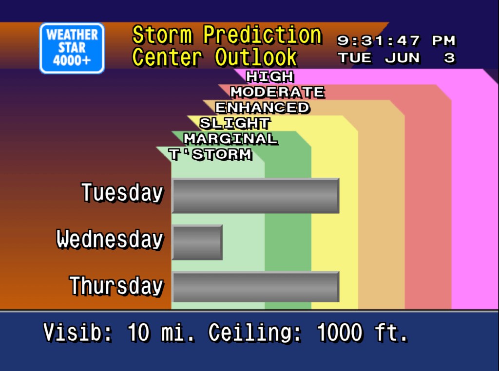
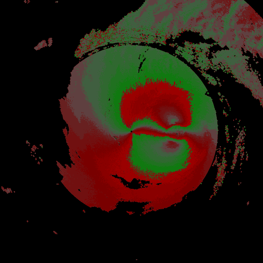
Just a few weeks prior to the huge bump in traffic I added a new screen to the Weatherstar, similar to the Hourly Graph and Hourly Forecast I previously added. This time I took the original air quality report, which is not in the Weatherstar 4000+ because the data for it is not available in the APIs I use for weather data, and re-worked it to share the three day Storm Prediction Center (SPC) Outlook. It shows the likelihood of severe weather over the next three days.
New SPC outlook screen on Weatherstar 4000+
The design of this new screen follows very closely with the design of the air quality display from the original Weatherstar hardware. The number of categories have been increased to match the SPC’s categories, and the color coding comes directly from the SPC generated maps which look authentic in the context of the Weatherstar. Three days are shown which takes the place of up to three cities that the air quality report would include. Some slight visualization adjustments were also added to help make the category and color linking easier to follow.
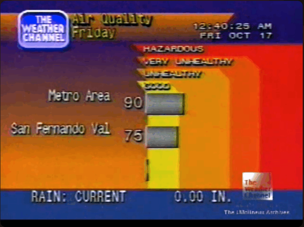
You can see the similarities and differences between the new screen and the screen capture of the original air quality display below.
Weather Channel screen capture from YouTube/cc17926
Please join the discussion at GitHub if you have questions or comments on the new screen.
The scanner will attempt to connect to ports at your IP address from netbymatt.com’s netowork and present results in a friendly grid format. All green “stealth” results are great!
The scanner has several uses besides overall security
Test to make sure a port is open, such as a VPN or web server
Test your network’s IPv6 connectivity. The scanner link above will attempt to connect to on both IPv6 and IPv4 and will present to you both addresses if both are found. You can then select which address to scan.
Finding your IP address remotely
Testing a headless server – The returned HTML is in a very straight-forward format and can be easily scanned by a human after running curl or similar from your server.
There’s a lot of technology behind the scenes to make this work. The link above has full details but some of the highlights include:
Scan originates from a different address than netbymatt.com
Micro-service architecture allows for easy scaling during traffic spikes
In addition to the free forecast and observation data that powers Temperature.Express, the National Weather Service also makes available live and archive data from their NEXRAD weather radar network. This data dates back to 1991. I have created npm packages for parsing and plotting this data. [Jump to packages]
Level 2 Data
Level 2 data is what you’re used to seeing in your weather or radar app. It’s the “how hard is it raining” graphics typically in green, yellow and red with red being the heaviest or most severe precipitation. More advanced users will also recognize the red and green velocity plot that shows wind direction and intensity.
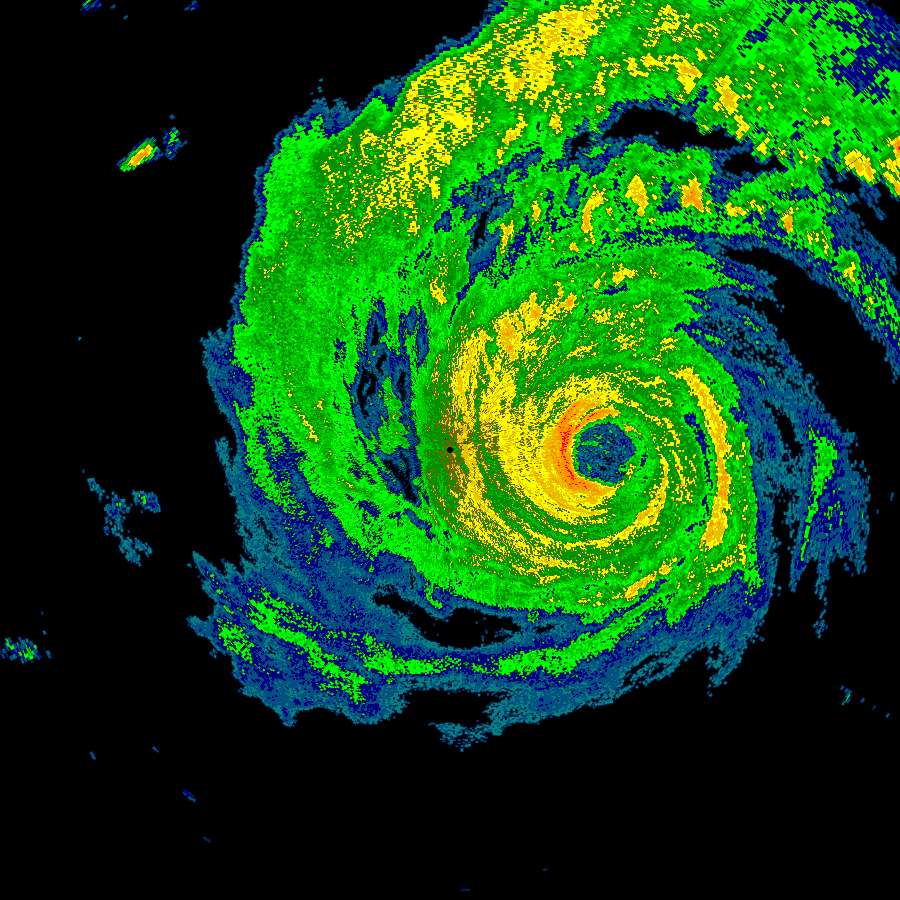
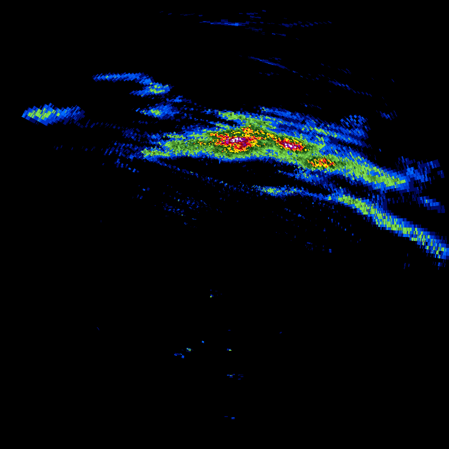
In 2019 I found nexrad-radar-data on Github. It worked, but needed some updating to to modernize the code and deal with the new compressed formats that were being stored to the archive. I then added plotting capabilities in a separate package. The results can be seen below.
Reflectivity plot of hurricane Harvey on August 25, 2017Velocity plot of hurricane Harvey on August 25, 2017
A commercial tool exists for viewing this data, as does a set of libraries for Python. Neither of these options lent themselves to the environment where I was looking to deploy them. So I went ahead and began improving what was available to suit my needs.
nexrad-level-2-data is the direct descendant of nexrad-radar-data mentioned above and outputs a JSON object containing all of the data from one level 2 scan. An excerpt from this data is below. Additional information on how to make sense of this information including links to formal specifications from NWS are available in the Github repo.
The changes were to the source repo were substantial. As I learned more about the newer radar formats it was necessary to go back and rework the core of the parser so that different message and compression types could be detected at the appropriate places. The data format is well documented but was designed in the 1980’s so there are a lot of less commonly used data structures compared to a modern system. The documentation makes significant use of “half-words” (16 bit values), and has a special floating point representation designed around the exact needs of the radar’s output. Some of the significant changes include:
Looking for compression headers and passing data to a gzip decoder. Several gzip blocks might be present within one file and the parser detects these additional blocks and decodes them accordingly. This is not a standard gzip file format.
In the mid 2010’s radar sites were upgraded with super resolution which more or less quadrupled the resolution of the data. This change puts all new data formats into the data files and the correct format needs to be determined before decoding can take place. The plotter also needs to identify the two types to scale the resulting images properly.
When using live data, it is delivered as “chunks” that are typically 1/6th of a complete scan per file. Various methods were developed to combine multiple independent files and recombine it with header data that only appears in the first file in the series.
The data coming from the radar is not perfect. After running the parser and plotter in a production environment for a year, several errors would repeat themselves. Careful analysis of the problematic files with a hex editor revealed truncated files, incorrect length pointers and missing slices of the scan. Best-effort methods were added to try and find the correct lengths, pointers and to flag missing slices.
Level 3 Data
Level 3 data is the result of compiling data across several minutes or hours, or text output of analysis algorithms that flag hail, rotation and other phenomenon. These different types of output are called products.
This data takes on a completely different format from level 2, and for several of the products does not even produce data that can be plotted. Below is the output of Digital Total Accumulation which acts as a digital rain gauge, estimating the amount of rain that has fallen during a thunderstorm event at any point within the radar’s area.
Digital Total Accumulation output from storms passing through the Chicago area on July 23, 2022
Even with the significantly different data format. A lot of techniques from the level 2 software could be leveraged to make decoding level 3 data a simpler task. Concepts like half-words and special floating point and fixed-point binary formats continued to exist.
Other data that is stored in the level 3 format is text-only and may be presented as the pre-formatted text shown below, or in a more structured form that lends itself to a JSON output.
What about level 1 data? Level 1 data is only published as part of select case studies and not on a continual basis like level 2 and level 3. It is the raw data that comes back from the radar antenna in analog form. Upon receipt, it is processed immediately at the radar site into the digital level 2 format that is distributed through the National Weather Service’s various channels.
Acquiring Data
The data is available freely through different cloud providers. A good starting point is Nexrad on AWS which at the time of this writing appears to have the most complete level 2 archives, live level 2 chunks and level 3 data. This AWS source also provides notifications for new data in some of the buckets.
Summary
The complete suite of four npm packages consists of:
nexrad-level-2-data, parses level 2 data files and returns them as a JSON object.
Back in the 90s it took a little more effort and planning to get a weather forecast. You could look at the newspaper when it arrived. There was the local morning news. A few radio stations might have it at 10 and 40 after. But for me I would go to Local on the 8s on The Weather Channel. I’ve recreated this with WeatherStar 4000+ and you don’t have to wait until the 8s any more! Oh, and the forecasts are current, no reruns from the 90s.
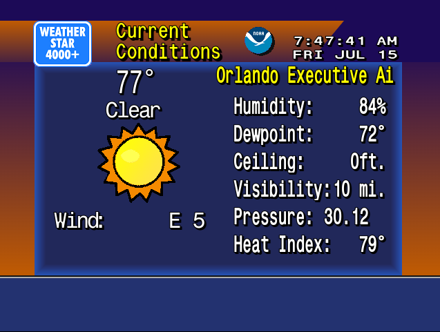
WeatherStar 4000+ Screenshot
The technology was really impressive at the time. The Weather Channel was on cable and at that time talked about weather forecasts on a national scope. But on the 8’s a local forecast was inserted into what was otherwise a regular, nationally broadcast cable channel. Wow! And if you went on vacation and watched The Weather Channel it was a different local forecast for where you were.
There is a lot of nostalgia for these forecasts. First there’s TWC Classics which documents and discusses the history of The Weather Channel through screenshots and video clips. Then there’s the WS4000 Simulator which strives for accuracy in both look and information that is presented. It runs on desktop OSes.
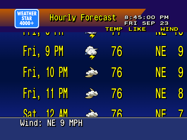
This project is a fork of ws4kp and runs in a web browser. As a refresher course in JavaScript I’ve made it my own by updating the interface to use new techniques such as Classes, and JavaScript standard replacements for jQuery. The project does not strive for accuracy as much as the Simulator does. This is much more of a no-fuss, just get a forecast project. I also made one addition that wasn’t present in the Weather Channel’s original hardware: an hourly forecast for the next 24 hours replaces the travel forecast in the default lineup. You can follow it and view the source on Github.
New hourly forecast display
The project’s name comes from the line of hardware that The Weather Channel provided to your local cable office to show the forecast. WeatherSTAR includes the acronym Satellite Transponder Addressable Receiver. As the acronym implies all of the data came from the satellite feed, and was hidden in clever ways right along the video broadcast. The first three units I, II and III were used throughout the 80’s and could only display text information, no icons with sun and clouds and no current radar. In 1990 the 4000 was introduced and was used for most of the decade. It featured graphics depicting current and foretasted weather and initially a still local radar image. A few years later it was updated to show several animated frames of the local radar. Wikipedia has a lot more information about the WeatherSTAR lineup.
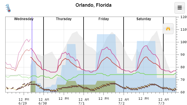
I’m excited to announce I am releasing a long-running side project of mine https://temperature.express. It’s built to get you a forecast quickly in a graphic format.
Example Temperature Express forecast
The basic code for it is open source and available on Github. A few excerpts from its FAQ help to explain the project:
What is this?
The National Weather Service provides a huge amount of forecast and climate data for free including an hour-by-hour forecast for the next 7 days. Unfortunately, getting it displayed in a concise format is not something they do well. The main graph attempts to display the most relevant parts of the forecast (high and low temperature, wind chill, heat index, clouds, precipitation and dewpoint) in an easy to digest format.
Why is this better than my weather app?
This web site is meant to be fast, fast, fast. If you add a bookmark to this web site to your home screen I’d be willing to guess that this web page loads faster than your weather app and gets you the information you’re looking for 2-3x faster every time.
I chose an intentional minimal design to leave as much space as possible for the data. I’m an engineer, I prefer accurate information over cute, bubbly buttons.
Why a graph?
It makes it quicker to answer the typical weather questions like: Will it be warmer or cooler tomorrow? – Just compare the heights of the red line. Is it going to rain tomorrow? – Look for the blue filled areas. Will the sun be out on Saturday? – Look for no grey filled area on Saturday.
The graph makes it much easier to convey how the weather will change during the day. Your favorite weather app, or search result card might simply say “Sunny, High of 80” today. But that tiny little bit of information might mask something important like the temperature dropping to 60 by 5 pm. That big temperature drop might mess up your evening plans if you were going to be outside.
If you’re interested in the exact values, just tap any point on the graph to get the exact value and the time for that value. Or, If you want to view most of the data as a table, you can get one by clicking the table icon on the menu. I think you’ll quickly see that the graph is a much easier to digest format.
Why do you work on this?
I’m a programmer. JavaScript, HTML, Node.js and other web technologies are not part of my day job, but seem to be where the innovation is happening. I use this and other side projects to keep myself up to date with them.