The Weatherstar 4000+ project has been a lot of fun to work on. And it received a huge boost the week of May 26, 2025 when it made the front page of Hacker News, and then to other social media sites. The outpouring of nostalgia for these forecasts and visuals has been incredible to follow along with. There were so many people sharing memories of vacations, childhood, parents and grandparents and many other great things. Thank you to everyone who has become a fan of this project.
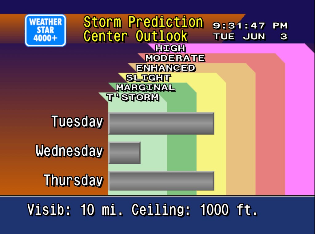
Just a few weeks prior to the huge bump in traffic I added a new screen to the Weatherstar, similar to the Hourly Graph and Hourly Forecast I previously added. This time I took the original air quality report, which is not in the Weatherstar 4000+ because the data for it is not available in the APIs I use for weather data, and re-worked it to share the three day Storm Prediction Center (SPC) Outlook. It shows the likelihood of severe weather over the next three days.
New SPC outlook screen on Weatherstar 4000+
The design of this new screen follows very closely with the design of the air quality display from the original Weatherstar hardware. The number of categories have been increased to match the SPC’s categories, and the color coding comes directly from the SPC generated maps which look authentic in the context of the Weatherstar. Three days are shown which takes the place of up to three cities that the air quality report would include. Some slight visualization adjustments were also added to help make the category and color linking easier to follow.
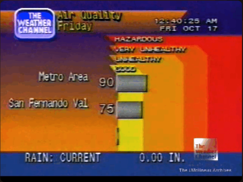
You can see the similarities and differences between the new screen and the screen capture of the original air quality display below.
Weather Channel screen capture from YouTube/cc17926
Please join the discussion at GitHub if you have questions or comments on the new screen.
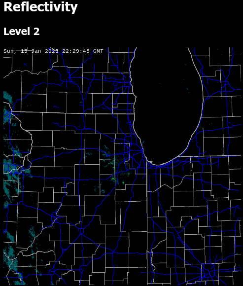
The NEXRAD Tools for Javascript released earlier this year now have a demo available! As discussed in the history of the libraries it would be cost prohibitive for me to make nationwide radar images available. But I’ve found an effective way to make some of the images I use every day available.
The demo shows level 2 plots for reflectivity and velocity and level 3 data for the hybrid hydrometer classification. It also includes a timestamp and road/county overlay on the radar image for reference, but those items are not part of the actual plotting libraries. The plots shown on the demo web site are updated in real-time, but a page refresh is required to load the latest image.
The complete set of tools is available on GitHub.
nexrad-level-2-data, parses level 2 data files and returns them as a JSON object.
Earlier this year I released the WeatherStar 4000+, a retro-looking weather forecast and current weather conditions app based on the look and feel of the 90’s Weather Channel.
We’re all used to weather information that’s very easy to access and is at our fingertips. My phone right now, in it’s “off” state, has a little blurb on screen with a few weather details. In the 30+ years since the WeatherStar debuted on cable both the accessibility and the amount of data available for a forecast is much more expansive.
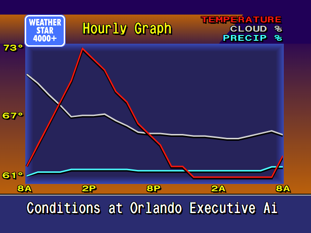
For this project and for me the challenge and question has been can I integrate new forecast information and not disrupt the nostalgia of the system? After a lot of though earlier this year, I took a cue from the “Travel Forecast” scrolling screen and turned it into an hourly forecast in the same style. It fit within the aesthetic and worked very well to show off new hour-by-hour forecast data that is now available.
But I personally never liked the long scrolling screen. It just took too long to get all the way through it. So inspired by first several weather apps that provide a graph for the hourly forecast, and then another of my projects Tempreature.Express, I developed some new graphics for the WeatherStar4000+ for this exact purpose.
New WeatherStar4000+ hourly graph display
It’s new, and it’s not part of the original system. But I feel that it very well captures the low-resolution 90’s design of the original. A lot of considerations around how much data to display and how to arrange it were made. I borrowed as much as possible from already existing graphics such as:
The x-axis times borrow sizing color and location concept from the Current Conditions and Travel Forecast screens.
The legend in the top right is borrowed from the Radar screen.
The line graphics are inspired by the Marine Forecast display that isn’t present in this WeatherStar4000+ but is in other adaptations as well as the original.
The blue background surrounded by orange is used on many of the text based displays although slightly modified at the bottom for the x-axis labels.
The rest of the header and footer is common to almost all of the other displays in the original WeatherStar 4000.
Also part of my considerations were should I intentionally pixelate the graph? I decided against this. In a previous update to the WeatherStar 4000+ I changed from drawing on a canvas, which resulted in a pixelated look when used full-screen, to HTML and appropriate fonts. This means that everything appears clean and crisp when running full screen. The weather icons (such as “Sunny”) are still the same size and do appear slightly pixelated full-screen, but that’s part of the charm and nostalgia. I did go through the exercise of pixelating this new display by drawing it at half-resolution and then scaling up but it just looked bad against the background and text that all scales fairly cleanly. I backed out that change.
Please join the discussion at GitHub if you have questions or comments on the new screen.
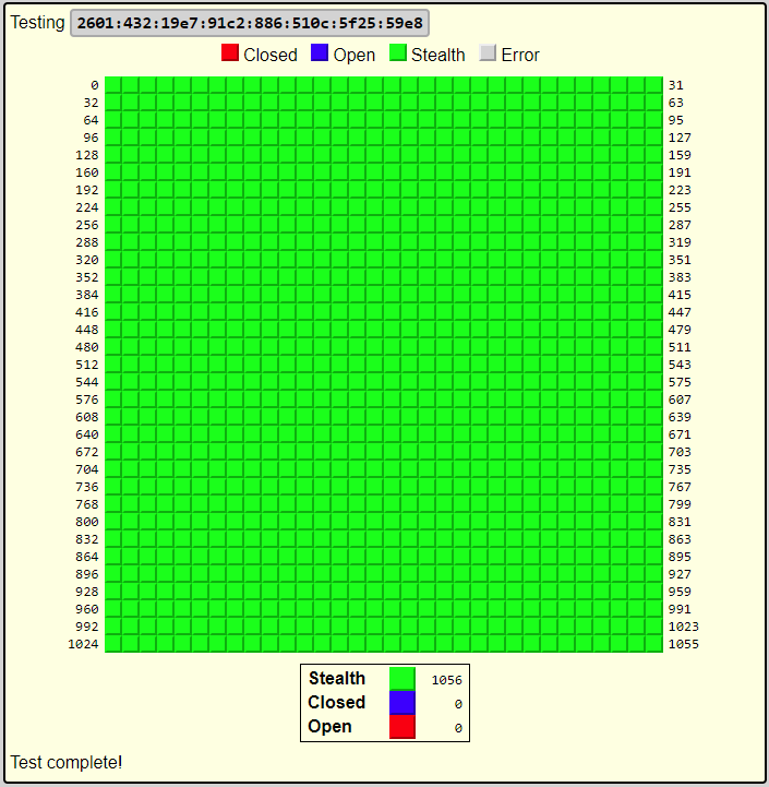
The scanner will attempt to connect to ports at your IP address from netbymatt.com’s netowork and present results in a friendly grid format. All green “stealth” results are great!
The scanner has several uses besides overall security
Test to make sure a port is open, such as a VPN or web server
Test your network’s IPv6 connectivity. The scanner link above will attempt to connect to on both IPv6 and IPv4 and will present to you both addresses if both are found. You can then select which address to scan.
Finding your IP address remotely
Testing a headless server – The returned HTML is in a very straight-forward format and can be easily scanned by a human after running curl or similar from your server.
There’s a lot of technology behind the scenes to make this work. The link above has full details but some of the highlights include:
Scan originates from a different address than netbymatt.com
Micro-service architecture allows for easy scaling during traffic spikes
My NEXRAD JavaScript libraries have been almost 15 years in the making. And they didn’t start with me plotting my own images.
In the early 2000s websites didn’t have rich, interactive interfaces with dynamically loaded data. Most people point to Gmail as the beginning of these type of AJAX web sites, as they were called at the time back in 2004. Although other web sites did dynamic loading and played other tricks with JavaScript and iframes to achieve similar interfaces.
Weather websites at the time typically had a static image showing the radar, or maybe an animated GIF. This was great. You could see the current radar without having to wait for the 5pm news or for 8 minutes after on The Weather Channel. But for someone who was interested in weather this was still lacking.
Screen Scraping
My first foray into this was through a technique called screen scraping. On my web server I would run a PHP script every few minutes that would check my two favorite radar images at the time: Accuweather and Wunderground. That script would determine if a new image was present and store it to my server. It would keep a total of 5 or 10 images expiring the oldest when a new one arrived.
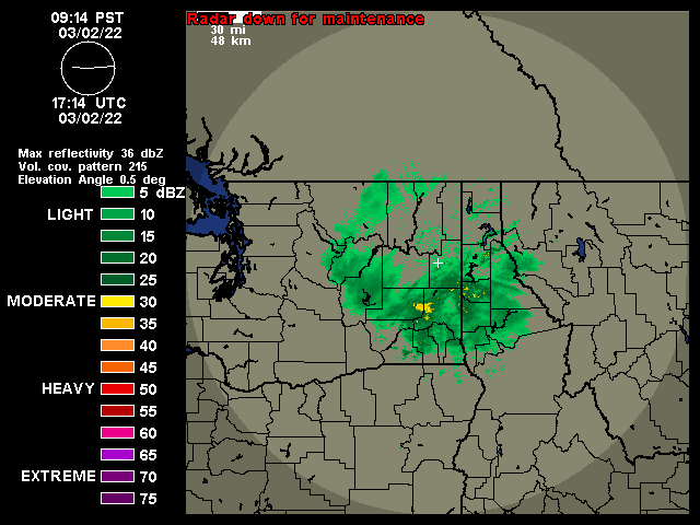
An example image from https://wunderground.com that would be screen scraped – their NEXRAD service shut down in March of 2022
The web page associated with it would let you view either set of images as an animation by changing out the src attribute on an image tag. This method had it’s drawbacks that have all been addressed in subsequent updates.
Some drawbacks were that images weren’t pre-loaded. On a dial up modem, not uncommon at the time, it might take 3 or 4 times through the loop before all of the images loaded.
Improving the interface
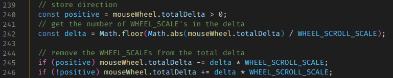
The first two changes implemented allowed for changing the frame rate and and manual forward/back control of the images. Specifically, forward and backward control was accomplished by using the mouse’s scroll wheel. Later when touch screens became prevalent, dragging across the image was added as another way to control this.
This easy manual control via the scroll wheel is something that I have always felt was lacking, and is still, in any radar viewer that I’ve used. For me, this control is critical as an amateur weather enthusiast to be able to follow the storm’s track and watch it’s development.
Excerpt from scroll wheel handler
Next I began pre-loading images. Initially this was done inside of a hidden div, although the method has changed over time. This meant that, especially on a slower connection, that the second and later frames might already be loaded when the animation reached them.
This interface at this point was nice, but if you left it open for several minutes you’d have to manually refresh to see if there were any updates. My initial fix for this was to have JavaScript automatically reload the page every few minutes. But then it got a lot better.
AJAX
In 2009 or 2010 I began learning about Asynchronous Javascript and XML (AJAX). This allowed me to make several changes to the frontend, and supporting changes to the backend. I was now able to load just a “shell” of a page and use an AJAX call to get a list of images from the server to load. This made it very easy to check for a new list every minute without reloading the page.
It also allowed for switching between the Wunderground and Accuweather image sets without reloading the page. And as the image sets grew to include TDWR, satellite, velocity and other regional and national images this became very helpful.
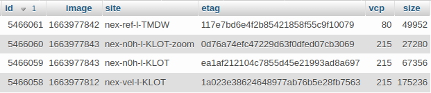
It was around this time as well that I began time stamping images. Or more specifically I would log metadata about the images to a database that included the time I downloaded the image. This was a reasonable estimate of the radar’s time. But it began to make a problem clear. Several of my image sets would occasionally get out of order. I never did sort out exactly why, and it didn’t happen on the source web sites. My suspicion was issues with caching at CDNs or connecting to a different CDN server on subsequent calls that was slightly out of date. This order-of-images problem lived on for almost 10 years.
Database excerpt
Jquery
The backend at this time continued to run on PHP. But around 2015 I started experimenting with Jquery and found that it was a much better way to handle all of the interactivity that I had added to the web page. I recall having so much code specific to Firefox, Chrome and at one point even IE and Jquery did away with this. It also integrated some really simple and helpful transition animations that very much helped show the process flow through the web site.
Jquery was a very nice tool at the time to deal with different browsers but by 2021 it was just about unnecessary. The remaining major players in the browser world had all begun following standards to a much better extent than in 2005 when I started this project. So at this time I refactored the code in two ways: removing Jquery in favor of new standard javascript methods and modularizing the code for easier maintainability.
Example of code that was Jquery replaced by plain Javascript
My Own Images
In 2018, while I was out of town for work and browsing the web aimlessly while stuck in a hotel room I came across a Javascript tool for plotting NEXRAD data. It worked, but it was incomplete with regards to modern compression methods used in the current NEXRAD network. I then set out to figure out where to get radar data and just happened to find that AWS S3 was now hosting both archival NEXRAD data as well as “live” data.
The journey here took a lot of effort. I’ll list some of the problems that had to be overcome:
The bzip format used in current radar products was not standard. There were headers interspersed with chunks of bzip data. The headers were not well defined but I eventually was able to sort them out and wrangle a nodejs bzip library to work on this data.
The data could be presented in an older format or the new dual-pol/hi-res format. These needed separate handling at the appropriate places to parse the data successfully. Separately, the plotting tool needed to understand the two types to be able to correctly show the data.
Plotting was slow, initially. A lot of work was done to speed up the plotting process. On a day with some storms, plotting went from 10s originally down to about 2s.
“Live” data, called chunks, took extra effort to process. A single image may come in as 3 or 6 chunks. I had to study a lot of raw radar data to determine whether to trigger on the 3rd or 6th chunk, and if there was another lowest-elevation scan at some other chunk.
I enjoyed the challenge of making all of this work and it solved the problem of out-of-order images that the screen-scraping method occasionally produced.
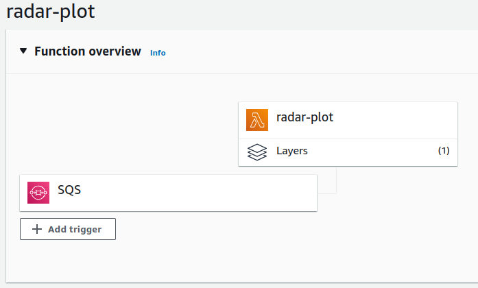
After I had updated the libraries to deal with the new data formats I had to find a way to run these. Previously I had used PHP on my web server that also hosted wordpress. But the new libraries ran on nodejs. This is when I discovered Lambda and it’s ability to run a one-off function with code that I supplied.
Lambda function configuration
So I set about implementing the library in a way that a lambda function could handle, and it was very capable of plotting this data and storing it to S3. Then other metadata and tasks were adapted to the Lambda environment. The final stack looks something like this:
An S3 triggered Lambda that reads the first chunk in the set of chunks as they arrive and determines what chunks should be decoded. When those other chunks arrive it then triggers the next process.
A plot worker receives the “interesting” chunk numbers from the previous function, downloads all of the data for each chunk, plots it and stores it to S3. The plotting consists of reflectivity, velocity at various resolutions and crops.
The plot worker sends a command to a third lambda function that writes metadata to the database for retrieval by the fronted.
A separate backend tool that monitors the api.weather.gov for current severe thunderstorm and tornado warnings and stores these to a database in a format that is practical for displaying on the radar map.
A frontend “list” api that can return a list of current images for a selected radar site, and that can list all current warnings for the current site.
The frontend queries the API for the list of images and warnings, loads the images from S3 and draws the warnings on the image.
Maps
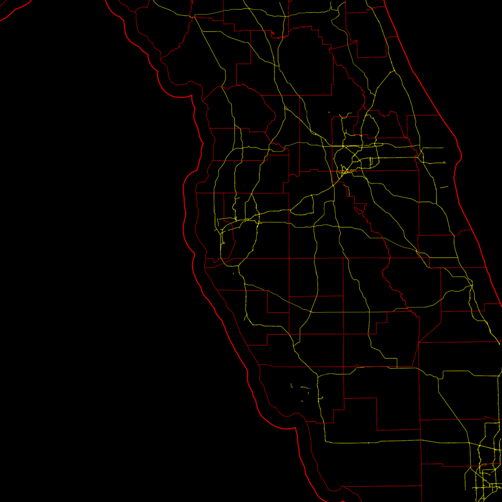
Radar images by themselves are not hugely helpful. You need some context to view them within. Typically road, state and county maps are shown over the radar plot. I used Open Street Map to provide major highways, county and state borders as a base-image for my radar plots. I downloaded the relevant data and used my own nodejs tool to draw these base maps from the data.
Map created through Node.js with OpenStreetMap data
Conclusion
I hope you have enjoyed this journey and would like to see the resulting web site. However I am keeping that site private. There are two reasons for this. One historical and one is cost. Historically, during the screen-scraping days I am sure there were copyright issues with me copying and re-displaying radar images from other web sites. So I kept the site private.
Today, the images are not copyrighted. In fact, any data produced by an agency of the United States Government can not be copyrighted. But there is now a non-zero cost with producing the images. For me to plot the handful of radars around my location, it’s reasonable. But if I were to open the site to the public I would need to plot every radar site. And I’ve calculated this at $150-200 per month which is well outside of what I could pay for out of pocket.
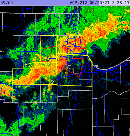
Tornadoes pass through the Chicago area on June 20, 2021 as displayed by NEXRAD library and frontend described in this article
It’s unfortunate, but I’m still very happy with my own results. And I do give my own web site a lot of traffic especially on days when there’s significant weather in my area.