I’m excited to announce I am releasing a long-running side project of mine https://temperature.express. It’s built to get you a forecast quickly in a graphic format.
The basic code for it is open source and available on Github. A few excerpts from its FAQ help to explain the project:
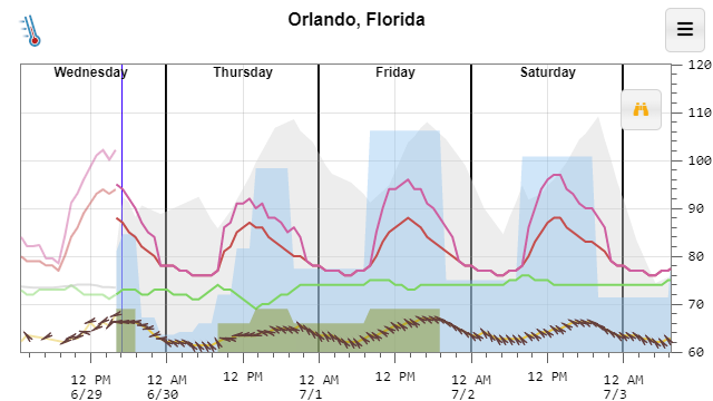
What is this?
The National Weather Service provides a huge amount of forecast and climate data for free including an hour-by-hour forecast for the next 7 days. Unfortunately, getting it displayed in a concise format is not something they do well. The main graph attempts to display the most relevant parts of the forecast (high and low temperature, wind chill, heat index, clouds, precipitation and dewpoint) in an easy to digest format.
Why is this better than my weather app?
This web site is meant to be fast, fast, fast. If you add a bookmark to this web site to your home screen I’d be willing to guess that this web page loads faster than your weather app and gets you the information you’re looking for 2-3x faster every time.
I chose an intentional minimal design to leave as much space as possible for the data. I’m an engineer, I prefer accurate information over cute, bubbly buttons.
Why a graph?
It makes it quicker to answer the typical weather questions like: Will it be warmer or cooler tomorrow? – Just compare the heights of the red line. Is it going to rain tomorrow? – Look for the blue filled areas. Will the sun be out on Saturday? – Look for no grey filled area on Saturday.
The graph makes it much easier to convey how the weather will change during the day. Your favorite weather app, or search result card might simply say “Sunny, High of 80” today. But that tiny little bit of information might mask something important like the temperature dropping to 60 by 5 pm. That big temperature drop might mess up your evening plans if you were going to be outside.
If you’re interested in the exact values, just tap any point on the graph to get the exact value and the time for that value. Or, If you want to view most of the data as a table, you can get one by clicking the table icon on the menu. I think you’ll quickly see that the graph is a much easier to digest format.
Why do you work on this?
I’m a programmer. JavaScript, HTML, Node.js and other web technologies are not part of my day job, but seem to be where the innovation is happening. I use this and other side projects to keep myself up to date with them.