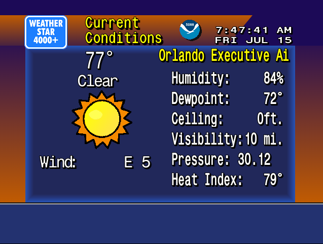
The Weatherstar 4000+ project has been a lot of fun to work on. And it received a huge boost the week of May 26, 2025 when it made the front page of Hacker News, and then to other social media sites. The outpouring of nostalgia for these forecasts and visuals has been incredible to follow along with. There were so many people sharing memories of vacations, childhood, parents and grandparents and many other great things. Thank you to everyone who has become a fan of this project.

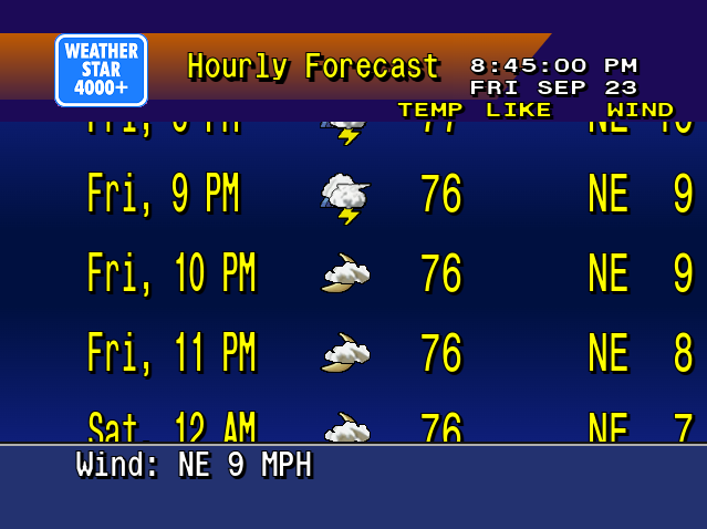
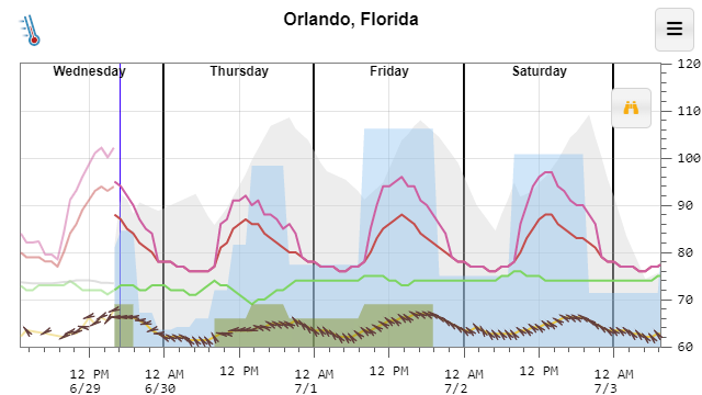
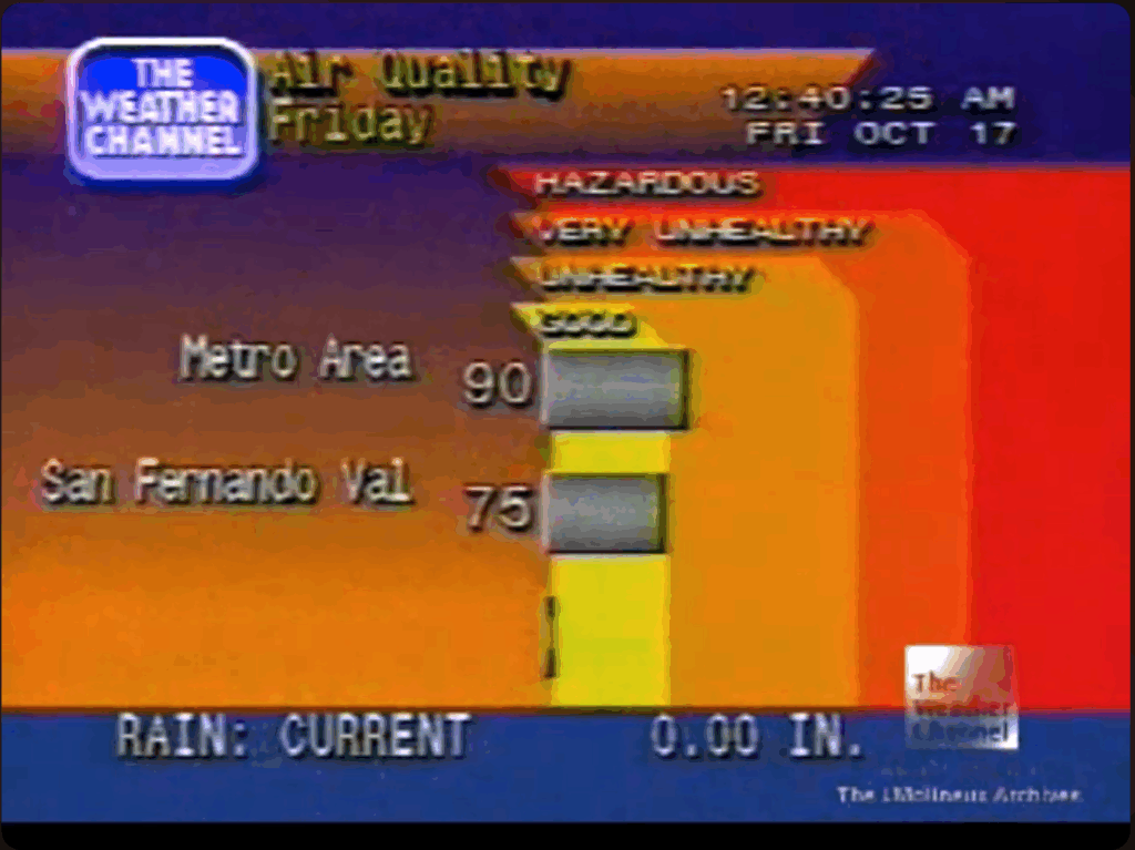
Just a few weeks prior to the huge bump in traffic I added a new screen to the Weatherstar, similar to the Hourly Graph and Hourly Forecast I previously added. This time I took the original air quality report, which is not in the Weatherstar 4000+ because the data for it is not available in the APIs I use for weather data, and re-worked it to share the three day Storm Prediction Center (SPC) Outlook. It shows the likelihood of severe weather over the next three days.

New weatherstar 4000 screen showing the SPC outlook for the next 3 days
New SPC outlook screen on Weatherstar 4000+

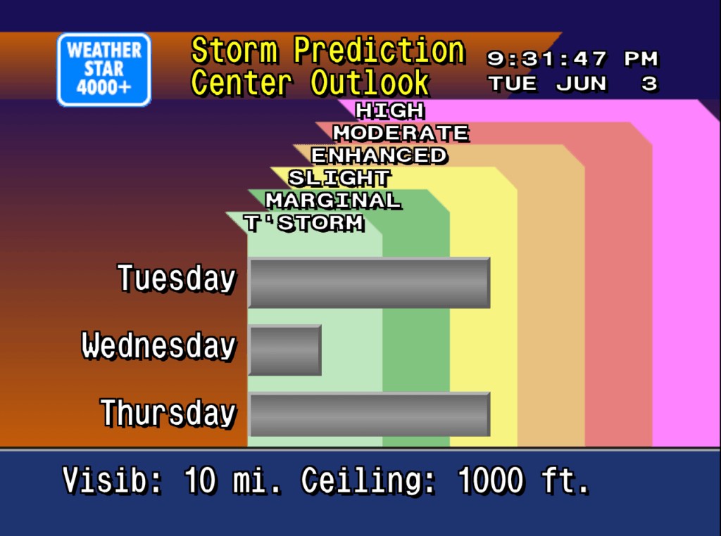
The design of this new screen follows very closely with the design of the air quality display from the original Weatherstar hardware. The number of categories have been increased to match the SPC’s categories, and the color coding comes directly from the SPC generated maps which look authentic in the context of the Weatherstar. Three days are shown which takes the place of up to three cities that the air quality report would include. Some slight visualization adjustments were also added to help make the category and color linking easier to follow.

You can see the similarities and differences between the new screen and the screen capture of the original air quality display below.

Weather Channel screen capture from YouTube/cc17926

Please join the discussion at GitHub if you have questions or comments on the new screen.

Back in the 90s it took a little more effort and planning to get a weather forecast. You could look at the newspaper when it arrived. There was the local morning news. A few radio stations might have it at 10 and 40 after. But for me I would go to Local on the 8s on The Weather Channel. I’ve recreated this with WeatherStar 4000+ and you don’t have to wait until the 8s any more! Oh, and the forecasts are current, no reruns from the 90s.

WeatherStar 4000+ Screenshot

The technology was really impressive at the time. The Weather Channel was on cable and at that time talked about weather forecasts on a national scope. But on the 8’s a local forecast was inserted into what was otherwise a regular, nationally broadcast cable channel. Wow! And if you went on vacation and watched The Weather Channel it was a different local forecast for where you were.

There is a lot of nostalgia for these forecasts. First there’s TWC Classics which documents and discusses the history of The Weather Channel through screenshots and video clips. Then there’s the WS4000 Simulator which strives for accuracy in both look and information that is presented. It runs on desktop OSes.

This project is a fork of ws4kp and runs in a web browser. As a refresher course in JavaScript I’ve made it my own by updating the interface to use new techniques such as Classes, and JavaScript standard replacements for jQuery. The project does not strive for accuracy as much as the Simulator does. This is much more of a no-fuss, just get a forecast project. I also made one addition that wasn’t present in the Weather Channel’s original hardware: an hourly forecast for the next 24 hours replaces the travel forecast in the default lineup. You can follow it and view the source on Github.

New hourly forecast display

The project’s name comes from the line of hardware that The Weather Channel provided to your local cable office to show the forecast. WeatherSTAR includes the acronym Satellite Transponder Addressable Receiver. As the acronym implies all of the data came from the satellite feed, and was hidden in clever ways right along the video broadcast. The first three units I, II and III were used throughout the 80’s and could only display text information, no icons with sun and clouds and no current radar. In 1990 the 4000 was introduced and was used for most of the decade. It featured graphics depicting current and foretasted weather and initially a still local radar image. A few years later it was updated to show several animated frames of the local radar. Wikipedia has a lot more information about the WeatherSTAR lineup.

I’m excited to announce I am releasing a long-running side project of mine https://temperature.express. It’s built to get you a forecast quickly in a graphic format.

Example Temperature Express forecast

The basic code for it is open source and available on Github. A few excerpts from its FAQ help to explain the project:

What is this?

The National Weather Service provides a huge amount of forecast and climate data for free including an hour-by-hour forecast for the next 7 days. Unfortunately, getting it displayed in a concise format is not something they do well. The main graph attempts to display the most relevant parts of the forecast (high and low temperature, wind chill, heat index, clouds, precipitation and dewpoint) in an easy to digest format.

Why is this better than my weather app?

This web site is meant to be fast, fast, fast. If you add a bookmark to this web site to your home screen I’d be willing to guess that this web page loads faster than your weather app and gets you the information you’re looking for 2-3x faster every time.

I chose an intentional minimal design to leave as much space as possible for the data. I’m an engineer, I prefer accurate information over cute, bubbly buttons.

Why a graph?

It makes it quicker to answer the typical weather questions like: Will it be warmer or cooler tomorrow? – Just compare the heights of the red line. Is it going to rain tomorrow? – Look for the blue filled areas. Will the sun be out on Saturday? – Look for no grey filled area on Saturday.

The graph makes it much easier to convey how the weather will change during the day. Your favorite weather app, or search result card might simply say “Sunny, High of 80” today. But that tiny little bit of information might mask something important like the temperature dropping to 60 by 5 pm. That big temperature drop might mess up your evening plans if you were going to be outside.

If you’re interested in the exact values, just tap any point on the graph to get the exact value and the time for that value. Or, If you want to view most of the data as a table, you can get one by clicking the table icon on the menu. I think you’ll quickly see that the graph is a much easier to digest format.

Why do you work on this?

I’m a programmer. JavaScript, HTML, Node.js and other web technologies are not part of my day job, but seem to be where the innovation is happening. I use this and other side projects to keep myself up to date with them.

Everyone thought Google was pulling a fast one over us on April Fools’ day in 2004 with Gmail. One gigabyte of storage? They can’t do that! Eleven years later and it’s still going strong. To me the stand-out features of Gmail are never deleting anything (and the search all your emails instantly that goes with it) and the amazing spam filtering. Since it’s debut Google has added many bells and whistles to the service, some of them oriented at organizing your inbox.

But last year they released Inbox by Gmail which takes organizing email to a whole new level. Inbox does a nice job of categorizing emails, and then puts them into bundles. This means that an order notification from Amazon, as well as the shipping notification automatically to into bundle called Purchases. What’s great is, by default, these bundles don’t generate a notification to your phone. Updates from forums that you may frequent do the same thing. You can then add additional emails to these bundles or create your own. It’s all drag and drop, and Inbox learns as you go. The purpose of these bundles is to allow you to browse the emails within them at your leisure. For example I tend to browse my forum notifications over my lunch hour.

Another great feature is that you can snooze an email. This completely hides an email from your inbox (unless you’re browsing the snoozed bundle) until a time that you choose. I tend to snooze emails that deal with stuff I need to do around the house until Saturday morning. At the appointed time, they pop up again just like a new email.

There’s a bit of a learning curve, but once you get used to it, it’s a very powerful tool.